In my last post, I talked about middle grade covers that drew me in and made me want to see what was inside. This time, I’m sharing books whose covers I simply love, even though I read the book for different reasons (good review, VCFA-related, highly recommended, etc.).
REPRESENTIN’ MY HOMETOWN WITH INTERESTING ANGLES
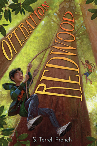
Operation Redwood by S. Terrell French
I’m a native northern-Californian. So I was really excited when I heard there was a middle grade novel that takes place there! (Seriously, it’s rare.) And heck yes, it involves redwoods. My only critique on this cover is that the title treatment makes the tree trunks look flat.
Compare with this cover, for example:
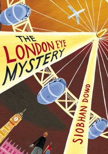
The London Eye Mystery by Siobhan Dowd
Because the title and author name are curved, they keep the shape looking somewhat more three-dimensional. (I know it’s still two-dimensional. YOU KNOW WHAT I MEAN.) Anyway, this is another cover I like because of the interesting angle, but I read this book because I’d heard it was one of the greatest MG mysteries ever. (Might be considered YA, but whatever.)
IT’S ALL IN THE DETAILS
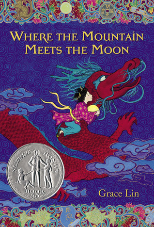
Where the Mountain Meets the Moon by Grace Lin
One of my favorite middle grade novels! And a case in which the cover tells you almost explicitly what will be on the inside. The fantasy, the whimsy, of that cover represents the novel so, so well. And look at all the textural details! From the sky swirls to the borders to the dragon’s scales.
(I read this because Riane, one of my former students, told me I should. Riane had excellent taste in books for a second-grader.)
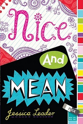
Nice and Mean by Jessica Leader
More details! Okay, so they’re moreso in the “Nice” half of the title than in the “Mean” half. But I really love when covers play with typography. Also, the colors! This book is by a friend, fellow VCFA-alum and agent-sister Jess Leader, so that’s why I originally read it, but now I still occasionally take it off the shelf to stare at the cover.
THE GIRL WITH THE SILVER EYES
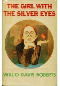
The Girl With the Silver Eyes by Willo Davis Roberts
This was the cover of the copy that I picked up from the library to read. Like Alana, Cimorene, and Caddie in my last post, I like that this girl has attitude. Seriously, I could read about kids with psychic powers intimidating the adults in their lives all day.
However, this book also has two other equally awesome covers:
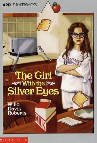
Hope you like toast, sucker
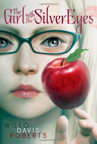
More like the girl with the creepy eyes, am I right?
Seriously, this book. Here’s some advice: if your book features someone with awesome super powers, try and get your publisher to showcase that on the cover. PS – Fun fact: Willo Davis Roberts lived in my home county for a while, which I only found out when I came upon a cache of her books in my hometown library’s Humboldt Room (a room devoted to books about Humboldt County or by Humboldt authors). Okay, that wasn’t that fun of a fact.
I read this book because Betsy Bird said it was great.
STYLISTIC, AWESOME
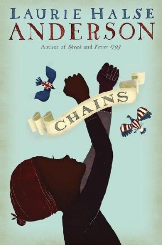
Chains by Laurie Halse Anderson
I think there’s a bit of backlash against silhouetted covers, especially when they’re used for books featuring non-white protagonists. So, I get that, and I agree with that. And I still like this cover because I think it represents the novel pretty well. Mostly because it looks like a political cartoon from the 1700s, what with the posing and the birds and the scroll-type title.
That being said, the UK cover is worth looking at for actually putting a face to Isabel, the main character:
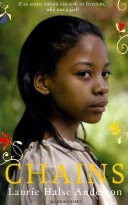
Also for the flowers
I read CHAINS because Laurie Halse Anderson was doing a tour through my city and I wanted to be caught up on her most recent books. (Then I ended up having to work and not getting to see Laurie Halse Anderson. A shame.)
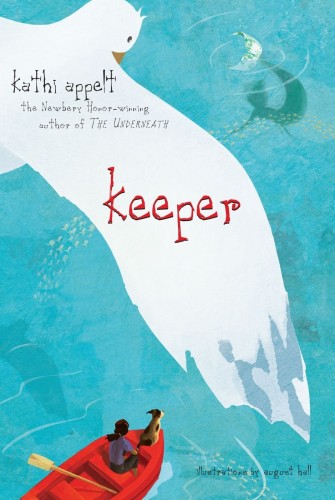
Keeper by Kathi Appelt
I like this cover for very simplistic reasons: mainly, the colors. The way the red boat matches the red of the title. The suggestion of gray on the seagull’s wings. The shimmering of the mermaid’s tail. And that sea of blue is so eye-catching!
I read this book because Kathi Appelt teaches at VCFA, but more than that, because I’d read KISSING TENNESSEE and THE UNDERNEATH and loved them both.
JUST BEAUTIFUL
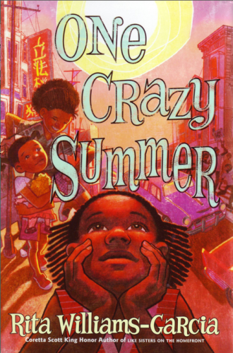
One Crazy Summer by Rita Williams-Garcia
Warm colors, reflecting the heat of an Oakland summer. Actual faces. Bold linework and shading. The insinuation that this is a book about discovery that is ultimately hopeful.
Fun fact: I have a shirt with the sketch of this cover on it! Gifted to me by Rita Williams-Garcia when I was her student at VCFA.
Another fun fact: it took me quite a while to find this cover. Most of the covers you see of this book are PRACTICALLY COVERED IN AWARDS. (Four, to be exact!)
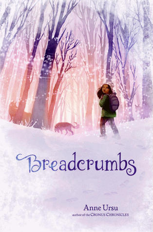
When this book first came out, it got so much buzz it was hard to believe there were any other novels out that year. Anyway, that’s why I read it. But as I was reading, I found myself flipping back to the cover over and over again, looking at that striking image of Hazel glancing back to her home before she departs into the forest. (With wolves!)
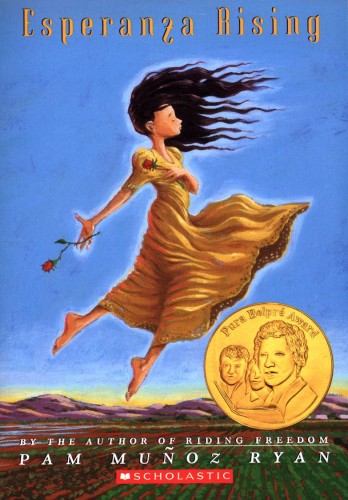
Esperanza Rising by Pam Muñoz Ryan
Back in college, I wrote a paper about Latinas/os in Children’s Literature. I talked about ESPERANZA RISING extensively, as it was (and still is) very popular, but I’d never read it. So before I turned the paper in, I read it so I could talk about it with confidence.
Anyway, I probably don’t have to tell you that the image of Esperanza floating in her flowing yellow dress and black curls has become somewhat iconic. It’s an image that sticks in your mind.
A COVER YOU NEED TO SEE TWICE
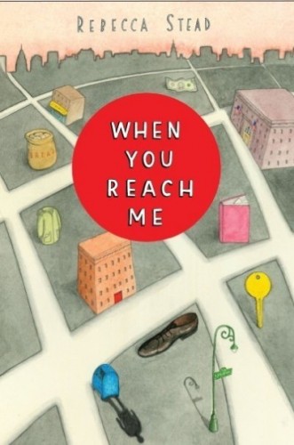
When You Reach Me by Rebecca Stead
Sometimes after you read a book, you say to yourself, “Holy Cats. I need to read that again.” Here is one of my very favorite covers, because by itself it’s very soft, clean, quietly beautiful. But after you finish the book, the cover makes a whole new heap of sense. And you marvel at it.
I read this because, you know. Newbery.
Okay, that ends my spiel on Middle Grade covers. Last fun fact of the day? Over the weekend, my cover quietly went up on Amazon and Goodreads. (Possibly elsewhere, but those are the only two places I’ve seen it so far.) So if you’re so inclined, and you don’t want to wait for me to post my cover (waiting on a good, hi-res image!), you can go take a look.